Reveres publicize excellent WHO "yardstick"
 Yesterday, I delivered a blog on the State of Bird Flu 2008. In that blog, I mentioned:
"Look at the latest WHO stats and extrapolate them over a year. By any yardstick, 2008 could shape up to be like 2005 or even exceed 2006."
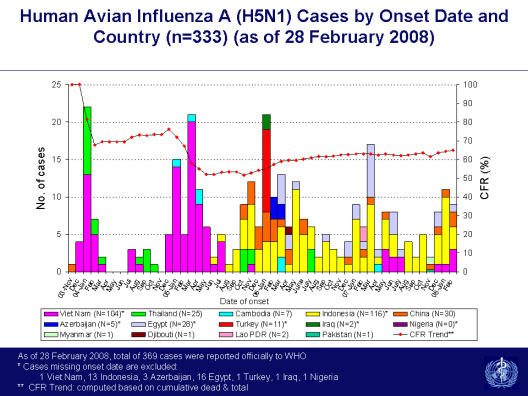
Thankfully, the Reveres of Effect Measure published the latest WHO chart, which allows us to look at the onset of human H5N1 cases by year and by nation. I am grateful they chose this time to help reveal this chart, which they interpret as showing 2008 as trending more toward last year than previous years. I am deferring to the Reveres' interpretation, since they are much better trained than this blogger at statistics. Obviously, I hope they are eventually proven right and I am wrong!
What is also interesting about this WHO chart is the shifting distribution of human bird flu cases over the years. This also, in my opinion, graphically shows us the dramatic effects of government intervention, culling, and awareness efforts when done properly. It also shows us what we cannot know, sitting in our offices and living rooms around the Core, as Tom Barnett would say: And that is how honest certain nations are when it comes to the reporting of cases.
Here's what I mean about cause and effect:
As you can see, from 2003 to 2005, Vietnam was Ground Zero when it came to human H5N1 cases. This prompted an unprecedented and extraordinary commitment of resources by the Vietnamese government to the containment and eradication of bird flu within the borders of that nation.
In response, by early 2006, Vietnamese human bird flu cases almost vanished. However, in that same time frame, Indonesia began its run as the new dominant nation for the detection of human bird flu cases. This dubious distinction has continued unabated ever since.
As Vietnam receded, Egypt joined Indonesia as the most prominent national hosts of human H5N1 cases. And then, as if calling out not to be forgotten as the veritable Cradle of Human H5N1, Chinese cases began to reappear. From late 2005 to mid-2007, these three nations comprised almost all human bird flu cases.
And then, despite all the work, education, planning and probable affront to human rights the Vietnamese government threw at the bird flu problem, human cases began reappearing there -- and have continued ever since. So their countermeasures may have been effective, but sadly, only temporarily so.
Staring out at you from the exact center of the graph is the Turkish outbreak of late 2005/early 2006. This fire engine red color serves as a warning to all that H5N1 can appear without notice and without warning and, therefore, vigilance is absolutely required -- everywhere.
The Reveres of Effect Measure remind us in their blog that...
Their blog can be found at http://www.scienceblogs.com/effectmeasure/ and the WHO chart can be (thankfully) seen full-size at http://www.wpro.who.int/NR/rdonlyres/7165D4BF-D820-4CB5-A1FD-267F905639D8/0/s2.jpg .If you look at the bar chart below you will see that this year's bird flu season is shaping up to look pretty much like last year. In the first two months of the year there are a few more cases but essentially the picture looks much the same. If that is indeed true, then also expect a spike of cases this month (March) since you can also see that is the past pattern. Already cases are being reported in Egypt, and of course, Indonesia. The countries involved this season have been Vietnam, China, Egypt and Indonesia, just like last year. Whether you consider that reassuring or worrying probably depends on whether you are an optimist or a pessimist. We tend to be cautious pessimists. Your mileage might vary.

Reader Comments